hugh macleod and microsoft
Wednesday, May 2nd, 2007rock on, blue monster.
you won me back.
rock on, blue monster.
you won me back.
i’m thinking of redesigning my wordpress theme and the top idea would rely on some smart color theme generation.
thinking about this made me think of stuff people have done with the flickr api and color, which reminded me of this awesome toy:
retrievr: http://labs.systemone.at/retrievr/
it lets you paint a picture and then looks for images on flickr with similar color distributions.
i don’t think i have linked to it before, and it brings me great joy, so i pass it along.
hopefully if i decide to upgrade my theme, you’ll notice, though the amount of time it takes to notice such things is my key lamentation with feed readers.
sigh.
naptime.
what i thought this panel was going to be about:
what it was about:
why the difference matters:
interesting snippets:
difference between design and engineering – design looks at the whole picture of a product and decides what to build, engineering figures out how to build the actual pieces.
jesus endorsement site
are they saying we should become industrial designers? is it more about the impact of hci on id?
yeah, they’re talking about thinking about how interaction designers have to think like product designers because products are becoming the interface.
ok.
got that one.
but what about the dialogue with industrial designers?
i should have listened more closely to the kodak guy. i think he was talking about that.
i was just writing a post about blood diamond, which i saw this evening, and recommend, when a wayward slip of my finger on the trackpad led me to instruct the browser to go “back”, thereby erasing my work. the first time, i cursed a bit about trackpads that are too smart for their own good, and about how wordpress should autosave the way gmail does. i’m borrowing a computer, so i hadn’t thought about the stupid “smart corners” feature in windows because i have a mac now and when i was running windows on my previous laptop, i turned the damn things off.
then it happened again, when i was nearly done, and even though i had smartly saved the post at an earlier juncture, i still lost a lot, and i don’t have the stomach to rewrite it all right now, so i’ll have to risk it for later.
i will take the chance to vent my frustration at this feature, however, and to point out that another smart trackpad feature – the two-fingered scrolling that comes with os X laptops – is COMPLETELY different, and has now become a part of the way i expect all trackpads to work, which is one way that i measure brilliance.
the difference is that it is not at all likely that i will absentmindedly place two of my fingers on the trackpad and move them in concert while i am thinking about other things, and yet, when i want to take advantage of the feature, it takes very little brainpower to do so. once i have learned it, i can use it as easily as breathing; until i learn it, i am not likely to engage it on accident with disastrous results that seem to occur as a prank from god.
so don’t make it easy to do frustrating things by accident, folks. it’s no fun. it makes you have to read babble like this instead of hearing me talk about feeling older and coming to respect leonardo dicaprio. sucks, eh?
anyway, autosave in wordpress would be a good thing either way. i should see if it exists.
so bonnaroo’s having a little logo design contest, and since i was holed up in my apartment over the holiday and i had a bit of an idea, i decided to try my hand, even though that hand was without a scanner or photoshop.
here is what i got with the aid a sketchbook, my digital camera, and the gimp:
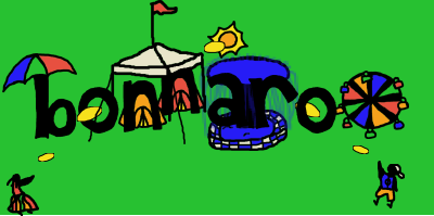
i like the cartoony style, but i think it might be too… unpolished cartoony, if that makes sense. i was rather astounded by the fact that i couldn’t find line smoothing options in the gimp, because i don’t consider that very hifalutin macrodobemedia technology, but maybe i’m wrong.
anyway, i might play with it more but i stopped for now.
do you like it?
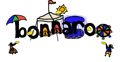
Update: a few very subtle changes – smaller fountain, wider “o” within ferris wheel, closer together, people closer to frisbees, optional green background removed. Better?
i’m probably taking the bus to london tomorrow, and i might take the late night bus because then i don’t have to worry about finding a place to sleep when i get there, and besides, one of the late night buses has leather seats and extra leg room.
party.
there isn’t a special discounted “funfare” available for the bus i think i want, though, which is annoying, and i have been poking around looking for other options because it kind of annoys me to learn that, had i booked more in advance, i could ride the train for cheaper than the bus, and the train has wi-fi.
pout.
it’s also hard to swallow that it is possible to book a plane ticket to amsterdam or barcelona for less than a bus ticket to london.
whatever.
what i’m sayin’ is, i went to lastminute.com to see if they had any better offers, and there’s a link in the corner that says “boss is watching. look busy.” and do you know where it goes?
mission critical market analysis
heehee
so if you’re reading from planet info or using a feed reader, hop on over and give me a holla to say what you think.
erik took the picture that i’m using for the header, during the post-capstone jaunt that he, tif, josh, and i took to st. louis to play at the city museum.
i had been saying that we should go to the city museum for months and months, and only now do we understand that it was all an elaborate ploy to get imagery for my blog.
bwah ha ha ha…
anyway, thanks erik. :)
i will credit you properly before the redesign is through, and i’ll check in with the queen when i’m in london in a couple months and see if any duchys or countships are available.
(because then you could have royalties…)
bad joke police say it’s time to get some sleep now.
i have so much that i’ve been meaning to post about that it’s not even funny, but instead you get this, because it’s easy. :)
i tripped over this blog today, and was struck by a few ways it breaks from the current blog layout cookie cutter. i like how it uses depth, rather than just width, to separate the main content from the sidebars, how it isn’t afraid to use the full screen even though the edges might not fit on low-res displays, and how beautifully it ties the levels together with that nifty thin band of color across the top.
ever since i heard scott mccloud talk at the closing plenary for CHI this past spring in montreal, i’ve been thinking more and more about the idea of the display as a window onto a larger canvas, rather than a projection screen that flips through one fixed-size image after another, and while this example was actually probably just designed by/for someone with the luxury of a wicked huge display, i think it hints at some of what might change if we think about the screen a little differently.
at the very least, it reminds me that i shouldn’t put off my own redesign any longer, and it gives me a few ideas about how i might get around the “sidebar, content, sidebar” wireframe that has been boring me lately.
do you like it?
design science, design art, and design reality
more than one kind of human-centered
the problem with problems
tim points out erik‘s mentions on slashdot and ars technica for his AbiWord/OLPC work with Summer of Code.
way to go, my friend.
you’re building ladders.
i look forward to talking about the view. ;)
I completed a Masters' Degree in Human Computer Interaction Design in May 2006, and then I traveled a bit to figure out what the flip I want to do with such a degree in the wide, wide world. After landing back on the west side of the Atlantic, I moved to Portland, Oregon, where I worked with some of my fellow Informatics alums for a few months designing medical equipment and figuring out how to help a company change the way they do design. It turned out to be quite a battle, and as the lowest head on the totem pole, I got released back into the wilds. The wilds are fun...
You are currently browsing the archives for the design category.
www.flickr.com
|