take it or leave it?
so bonnaroo’s having a little logo design contest, and since i was holed up in my apartment over the holiday and i had a bit of an idea, i decided to try my hand, even though that hand was without a scanner or photoshop.
here is what i got with the aid a sketchbook, my digital camera, and the gimp:
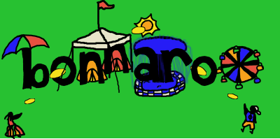
i like the cartoony style, but i think it might be too… unpolished cartoony, if that makes sense. i was rather astounded by the fact that i couldn’t find line smoothing options in the gimp, because i don’t consider that very hifalutin macrodobemedia technology, but maybe i’m wrong.
anyway, i might play with it more but i stopped for now.
do you like it?
Update: a few very subtle changes – smaller fountain, wider “o” within ferris wheel, closer together, people closer to frisbees, optional green background removed. Better?

January 4th, 2007 at 10:48 am
I don’t know anything about Bonnaroo, or what people who do would find appealing, but as logos go that one looks groovy. I like the unpolished look. It probably wouldn’t look as good if it was cleaned up.
January 4th, 2007 at 11:07 pm
I really like it too. I also think it needs a little more blue space between the r’s.
ps – remember the feeling that goes with the big smile and let it fill you up! Magic can happen at any moment.
January 6th, 2007 at 4:05 am
Is it suppose to be huge? The a and the r look less connected by the fountain now. Which is good. The white background looks too plain or something. Still looks plenty funky.
January 6th, 2007 at 9:39 am
oh, thanks. i forgot to resize it, and my blog did it for me so i didn’t notice.
the background is transparent, not white, so it should be whatever color you put it on. does it look white within the page? what browswer are you using?
glad you like it. :)
January 6th, 2007 at 12:19 pm
I was using IE. I’m looking at it in Firefox now, looks great. Sorry.